I will get down to the requests soon, I have been a little busy with other commitments recently, job and people visiting mainly but I have got a design half baked and I think it works half decently with Saint Etienné but still a long way to go as of yet. Not had many ideas for designs and this one as it stands is just an hours worth of moving shapes around but lets not talk about that for now.
Here's a team which needs no introduction whatsoever, Arsenal F.C. For this I reverted back to the template I used for the Valencia kit which is just ages ago now, I updated it a bit too by drawing in actual finger shapes and changing hair around to represent actual players rather than just a default model.
The kit design itself is the same as Coritiba, Bielefeld and Santander but with this view you can see how it would appear if it was worn as one, of course there have been minor adjustments to it but I feel it still displays the design how I would wish it to look.
I have been asked what is the pattern on the home kit and I am sure I will again if I don't say anything now. It is actually the Fleur-de-lis pattern taken from Arsenal's previous logo, I have searched and searched for it's meaning and purpose in being these but have come up short, but hopefully it is something really interesting :P
The player in question is of course Emmanuel Adebayor (now of Manchester City) but at the time he was pretty much Arsenal's most recognized player from his hair, boots, number and of course his Togolese motifs. I got the idea for this style of presentation, from pictures I saw of Nike's kit launch for Atletico Madrid, with a team name and logo on a wall behind the players and tried to put this in place here.

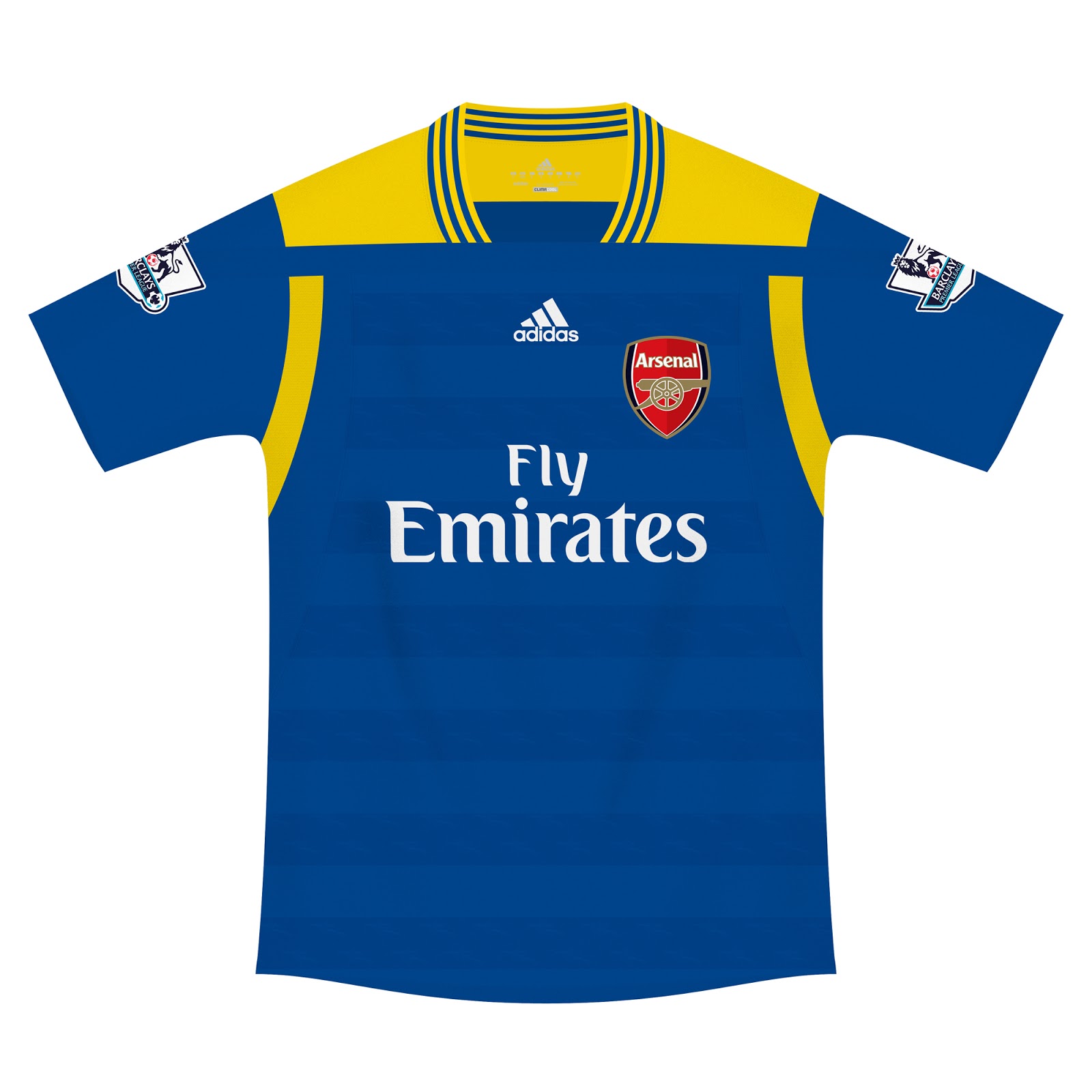
For the away and third kits I asked people what they think would be best and just used the first two responses I got. I think the third works quite well, been a bit of a mystery why Arsenal have never used a black shirt but thats just the way it has been. I tried to keep quite a good portion of grey on the shirt so it's not too dark and with the symmetrical look it actually appears quite classical with the collar being a thin V. The player here is Theo Walcott but the only thing I could really show was his straight fringe and number 14 logo I guess skin colour helps to recognize him too.

The away (Cesc Fabregas, which actually looks noting like him, the hair is just pish) is a green and dark blue number which was rumoured to be a third or away kit for the new season but never came to fruition, I'm not overly keen on it, I think I could maybe have used a nicer shade of green the compliment the blue but it never came out like that.