Here are some vest tops I made for a few Portuguese teams I am quite please with how the came out...
C.F. Os Belenenses
Leixões S.C.
Rio Ave F.C.
Friday, 18 December 2009
Wednesday, 16 December 2009
Not dead, but dieing
I have been quite busy in many ways so no posting and I think future posting may be at long integers like this too due to lack of time, and a slight lack of interest but this of course may change for me in the future, we'll see.
Just a quick post for these Turkish casual shirts, I personally wouldn't wear shirts like this with printing, but I have been wearing a few plaid shirts recently which gave me the idea to try something.
If you don't like them then fkdsfdskjasdfds.
Kayserispor KulübüDenizlispor KulübüAnkaraspor Anonim Şirketi
Labels:
Ankaraspor,
Casualwear,
Denizlispor,
Infinite,
Kayserispor,
Turkey (Türkiye)
Friday, 30 October 2009
Casualwear (Russia)
For the next few posts I'll be displaying something a little different from kits, but still football related so don't despair. Basically what I have made are a few t-shirts and stuff such as that which you would wear in everyday life 'casually'. For my choice in teams I just used a random number generator and went with whatever it picked and then counted it on the UEFA list then, associated numbers with teams in the league it picked and drew numbers again so it was a totally random process.
Well the first number drawn gave me the Russian leagues to choose from. From that, I made sure it was just the top two leagues to choose so I would at least know something about the team. First team out of the hat, so to speak, was Luch-Energiya Vladivostok of the Russian First Division (below the premier league). Luckily I know a little about them and their geographic remoteness makes them quite an anomaly in European football. If they were in a European competition and drew an Icelandic team it may be the first time a team have had to fly across America to get to their European tie as it would be closer than going trans-Europe.
When I set out to make casualwear I wanted the shirts to have original qualities unrelated to the club combined with history, so a mix of the old and new. With the Vladivostok t-shirt I was inspired a bit by American basketball shirts and I stuck with this idea for it, using a kind of Americana writing, I have also used a kind of 80's/early 90's style star shapes with solid colour bands to give a funky retro look. The blue colour scheme in one that features in Vladivostok's home shirt although as a secondary colour behind yellow. The tiger is from the teams logo and inside the collar is an old map of the Vladivostok region with the word Восток (Vostok - Russian for East) highlighted. I realise now looking at these I have made the collar far too small, just poor drawing from me.
Second out of this mystery hat was current and maybe soon to be consecutive champions, Rubin Kazan. Kazan has a rich history being the capital of the tartar region, which is actually where the club colours come from, the flag of Taratarstan. So I thought it was quite important I included these making the majority of the shirt an unusual shade of dark green with a reasonably light red to highlight it. I have given this t-shirt more of a grungy look as I thought it suited the colours quite well. Also featuring on this shirt is a huge star highlighting their success in last season's premier league, a bit Hollywood styl-e, their is the Kazan dragon and the coat of arms of Tartarstan within the collar.
Finally is FK Moskva, the government owned capital side. They are quite a newish team just like Midtjylland were being founded in only 1997 but only being known as FK Moskva since 2004, I have gone with a burgundy colour which is similar of that of their shirts. The spirally shape is a bit random but I also think it has a bit of an element of the space race look to it, so in that way fits with a government owned team, in the collar is the coat of arms of Moscow as I had no better ideas.
Labels:
Adidas,
Casualwear,
Luch-Energiya Vladivostok,
Moskva (FK),
Rubin Kazan
Thursday, 29 October 2009
FC Midtjylland
Located in the centre of Denmark, Midtjylland (literally central Jutland) are a very recently formed team, having existed for only 10 years they have spent all but one year in the top Danish league they have made some very respectable season finishes including 2 second placed ones and runners up in the Danish cup, but actual honours have are still yet to materialise for them. Some of their star players over the past few years have been Mohammed Zidan who made his name at the team scoring 30 goals in just one season, who due to this actually had his shirt number 14 retired in his honour. Another player who may be familiar to fans of the English leagues and who features on the shirt is former Derby County and West Bromwich Albion defender Martin Albrechtsen.
For the shirt I used the same design as I had previously for Brescia and Tromsø but as Midtjylland only have a short recent history I have thrown in some unusual elements to make it a bit more striking and engaging on the eye. The 'traditional' colours of the team are red and black so I ran with this as to gain a tradition it would need to build up after many years. The teams nickname is 'Ulvene' which is 'The Wolves' in Danish, and if you look closely at the logo you can make out a wolves face too which I though was just some kind of odd wican symbol to start with, so I decide to try something which looks roughly like it has been torn by a wolf's paw so the stripes flow in an unusual way. I have also made the shoulders unsymmetrical to give more of an unusual look to the shirt.
For the away I have opted for a neutral white colour with black and red elements of the home shirt. You can also see the unsymmetrical look of the shoulders in the red a lot better than you could on the home.
Labels:
Denmark (Danmark),
Infinite,
Midtjylland (FC),
SAS Ligaen
Wednesday, 28 October 2009
Tromsø & Brescia
Hello again and welcome to another edition of more kits, I'll cut out some of the usual waffle though, but I can't promise that.
Today I am posting up kits I have made for Tromsø I.L. of the Norwegian Tippeligaen and Brescia Calcio of Italian Serie B they use the same new template as the previous Kielce and Saturn kits but a different design, I am however more pleased with how this one turned out. I have returned to a symmetrical design instead and it doesn't look as unusual but I think in comparison this rises above the other by having better elements on the sleeve and a nicer looking collar and pleasant flicks here and there.
Tromsø I.L. are the most northern most premier football team in the world so come as a bit of a novelty to me for this reason. I would like to hear of other team who may be further north who are in lowers leagues though. Tromsø always pose a difficult test in both domestic and European competitions due to a mix of the climate and skill of the players who are used to such conditions. In their '97 Cup Winners' Cup run they managed to defeat Chelsea 3-2 at home in blizzard conditions only to be turned over 7-1 in the return leg and Stamford Bridge. In their 2006 UEFA Cup run they also managed to defeat both Galatasaray and Red Star Belgrade, but still finished bottom in the group stage.
Their kit is traditionally red and white stripes so it was important I didn't play with that too much, the rest of the kit is just something I thought looked good, involving both curves and sharp angles resulting in a bit of a flame look on the sleeve which wasn't on purpose, it just happened like that. The shorts and socks are sort of knock off of Nike designs, the socks are pretty much identical, but the shorts do have their own unique look.
The away throws together the identifiable red and white of the home with a distinguished blue colour, a colour which is pretty regularly used as an away colour by the club, the collar can also be seen a lot better on this than the home, I have given it a quite dynamic sharp look something that was missing quite a bit from the previous designs.
Now on to Brescia, a perennial Italian yo-yo team to say the least. They have bounced all around the Italian league system for their near 100 year history having employed a wealth of talent in that time, probably most famously Roberto Baggio even retiring the number 10 shirt in his honour for a 4 year stint at the end of his career. Currently Brescia are competing in Serie B, the Italian second division and only just missed out by result of promotion playoffs to get back into the top flight football.
These Brescia kits are among some of the favourites I have made, I think they're really classy even though they're quite minimal and the touch of gold from the logo really sets off the kit. I also think it helps that they have a minimalist looking sponsor logo in the shape of the 'Banco di Brescia' logo.
The away, predictably is just a reversal of colours from the home shirt, not much else to say other than that.
Sorry that I waffled.
Sunday, 25 October 2009
Once again...
Sorry for the long time between posts, I recently tranferred a lot of files to my external hard drive including kits I had made but then it stopped working *sigh* so I couldn't get anything for sometime but luckily it is back and operating as normal so I can show you something I have made, quite some time ago now.
To be honest though I've not made a great deal either due to a combination of mental blocks and lack of desire, but I do have stuff I can post up.
The first two teams which I am going to be displaying today are from Eastern Europe, and one of which I have already posted something up on, but didn't go into any detail about the club at all, so I'll do that now shall I?
Korona Kielce, from Kielce funnily enough, that's in Poland and currently compete in the Polish Ekstraklasa. A team I follow to an extent because of a Polish friend of mine, it was my first and only real affiliation with any Polish team so I consider them to be my team there. They have quite a checkered history involving promotion, relegation, corruption, new stadium and even challenging for European places. the team was founded in 1973 from a merger between two teams and since then they have further merged with other teams to become what is recognized as Korona Kielce today. 2002 is pretty much when I first heard about them and funnily enough (yeh quite humorous mood today) they started what wikipedia describes as their golden age began with their rise to the Ekstraklasa from the 3rd division no less. On the back of this success they have had a new stadium constructed and even made a fifth placed finish in the league, two years later however along with Zagłębie Lubin they were relegated to the second division for their part in a corruption scandal. All has worked out now though and are back flying high in Poland.
The kit is in their traditional yellow and red stripes with yellow shorts and yellow socks. I wanted to try something asymmetrical with my design as I had noticed a slight pattern emerging so I mixed it up a little with the kit of low sash you can see, (this will be more apparent on the next team I show you). The collar is inspired a bit from one of Adidas' old 'uns and is supposed to look a little turtle neck like just hugging a little but not constricting the throat. Their are also flicks of black over the shirt as a tertiary colour it is also a colour Kielce regularly use in their designs. The shorts are also asymmetrical but again you will be able to see this more clearly on my next kit.
For the away I have used black as the main colour with yellow as a secondary, black is regularly used as change strip in real life also. With this you can also see the asymmetrical design on the shirt better.
My second team I am covering with this design is Saturn Ramenskoye or now known as FC Saturn Moscow Oblast (Сатурн Московская область) a Russian team who if I am honest i don't know a great deal about so excuse me while I recite a wiki article to you. Based in Ramenskoye / Ра́менское on the far outskirts of Moscow they are nicknamed the Aliens because of the Saturn name, which I don't have the foggiest where it comes from at all. The club have had limited success in their history but have managed, like Kielce, to come from the 3rd division to the first in the space of 5 years and have cemented themselves as a regular in the league, citing a 5th placed finish, again like Kielce, as their best to date. Oh one last thing they also boast a record of fielding the oldest scoring player in the Russian Premier League which was Sergei Natalushko at the age of 39 against Lokomotiv Moscow.
The team are also known for playing in black-blue stripes but I ditched this in favour of predominantly blue with dark blue as the secondary colour. The shoulders are in dark blue as well as the 'sash' across the kit, the sleeves are mainly white just cut of by the dark blue spikes. As I told you before you can see the shorts properly on this kit, giving them almost half each colour and white at the sides. The socks are also an amalgamation of the three colours.
The away strip is a grey and blue number much in the same style as the home just with a few tweaks to where the colour on the template is located.
Thursday, 24 September 2009
I suppose I should post something.
Well as promised I will explain that ghastly last set of kits, just looking at them again now and they aren't pretty are they, not sure what I was attempting but here goes nothing, I'll try and explain it.
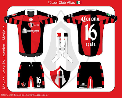
It started by just putting a few lines together in photoshop, see if something would work and look right. Once I got that "right" I set about changing the cut of the shirt which was quite stale and sameish in a lot of my previous kits. I also wanted to try a something little different for the collar, well, different for me anyway. So I decided on a fold collar with extra detail I guess you would call it, beneath the collar itself kind of reminiscent of what Real Madrid used on their centenary kits, just a bit more shit though. I also wanted to add in some sort of design feature that would stay with the design along the range of teams I would make with it. For this I decided the hoops I used on Club Africain would be an ideal choice (on the underside of the sleeves only) and I still stand by this decision, even though it has been criticised a bit. This is why there are hoops on the Atlas kits which don't have a tradition of using them.
I did buckle however when I was making these Dinamo Zagreb kits and change the hoops to checkers to fit in with their rich history in Croatia. I chose Dinamo (not to offend them with this shite template) because they are another team which are a bit special to me. I once sneaked into their Maximir Stadium, not when any games were on, but when it was abandoned, it was quite an experience that's for sure, and this Dinamo caravan is an enduring image which is definitely going to stay with me for a long time. Another reason is that the place I was staying in Zagreb was of course ran by Dinamo fans and because I showed an interest in Dinamo they gave me lots of free beer and were very funny people!
Dinamo are of course one of the strongest and most popular teams in Croatia, only rivalled really by Hajduk Split. They have produced a lot of Croatia's most talented players definitely names you'll recognise include Davor Šuker, Zvonimir Boban and a few more modern ones like Luka Modrić, Vedran Ćorluka and Ivica Olić but the biggest legend of all features on the back of the shirt. :-D
My version of the kit contains all the league sponsors which featured on their most recent kit, this is a sad reflection on how much Croatian football needs to advertise to keep its clubs running especially due to their most talented players being poached early by the bigger foreign clubs which in turn means poor performances in European competition, if they had all the players they had produced still with them then they would definitely be consistently making the group stages of the Champions League or the latter stages of the Europa League. I have used silver instead of white as the secondary colour as it just makes a change and Dinamo have used it before while with umbro and it looked pretty good to me.
The away kit is an orange number, simply because they had an orange away kit last season, other than that their is no real reason. Laziness.
Sunday, 6 September 2009
Club Africain (النادي الأفريقي) & FC Atlas
Hi, I've been away recently so no posts, been at Leeds Festival listening to some music and getting extremely drunk, turns out that drinking heavily for 4 days straight is no good for you go figure? and since then I have been quite ill, but luckily it has just been flu and is going now but still feeling a bit worse for wear so this post will be short.
I've made kits for these two teams as I wanted to venture into Africa with my kits and Club African have quite a recognisable look of red and white hoops. I also wanted to make something Mexican and Atlas de Guadalajara are my favourite team from there so was quite obvious for me to make them.
I'll post more about the design in my next post as I need to throw up, too much information?
Sunday, 23 August 2009
Maccabi Tel-Aviv (מכבי תל-אביב) & Omonia Nicosia (Ομόνοια Λευκωσίας)
Today I bring you what I could call my Mediterranean template as the two teams I have produced with this template both come from this region or more specifically the Eastern Mediterranean. Maccabi Tel-Aviv of Israel and Omonia Nicosia of Cyprus two of the furthest south east outreaches of European football and relatively unknown histories to most Europeans not from the region.
Maccabi Tel-Aviv is one of the oldest sports clubs in Israel, the football part makes up a far larger organization which partakes in a lot of different sports such as Basketball, Volleyball, Swimming and Handball. In fact the basketball section of the organization is one of the most successful teams in Europe. Back to football though, Maccabi (which refers to one of the Maccabees, whose stories have become synonymous with courage, victory and success) have won the most league titles in Israel and as well as this have also won the Asian Champions Cup twice when Israel was once affiliated with the AFC rather than UEFA. Being the most succesful and most supported club in Israel, Maccabi has had some very good players in it ranks that are famous in the rest of Europe such as Eyal Berkovic (אייל ברקוביץ'), Tal Ben-Haim (טל בן-חיים) and John Paintsil, although Berkovic is more recognised as a Maccabi Haifa player, he did infact end his career with the Tel-Aviv club.
I am quite please with the design of the shirt, I intended to make something a bit adidas-y and I think I have achieved it without having to add three stripes. The collar is taken from Liverpool's 06-08 kit, well it is modelled from that and the lines from the collar down the sleeves are reminiscent of last years training kits. Maccabi Tel-Aviv tend to change the design of their kits very often, from stripes to plain yellow to even checkered kits so I thought by adding a blue chest band it would fit in well to that pattern of variation and also add a bit of an individual touch. While making the back of the shirt I didn't intend for it to look like the front of adidas' kits a few years ago but I thought it looked a bit plain so I added those flecks and I think it turned out well. The shorts as you know are not a strong point in design for me and I am not impressed by these, they are very much an after thought. The socks however I am quite pleased with, I tend to be getting better making original sock designs, this one is intended to have a different cut around the calf on the fold over being a more dynamic looking V shape instead of the conventional round style.
For the away kit I have gone for a colour scheme based around the national flag, using the Israeli white and blue colour scheme, it was tough to choose whether or not to add the two blue bars across the front of the chest (like the flag) and I sort of regret doing that now as the shirt is perhaps busy enough as it is. It was also a decision before even designing the template that I wanted the back to be a different colour to the front on the away shirts as I really liked it when Kappa did it for their kits a while back now.
Omonia Nicosia has traditionally been the most successful club in Cypriot football until this year where they were over taken in league titles by city rivals APOEL. During the 70's and 80's, Omonia were the dominant power in Cypriot title race capturing 14 out of 20 league titles in that period, the 90's and 00's have been barren in comparison, with only 3 titles with Anorthosis, APOEL and Apollon all overshadowing them. Although not being a force in European football or even Cypriot football at the present time them have managed to capture one big name player, that being former Wisła Kraków and Celtic striker Maciej Żurawski who has quite a good scoring record at both club and international levels, if they can build on this they are sure to recapture the glory that the 70's and 80's teams enjoyed.
For the kit I thought it pretty important to bring more green into the mix as that is said to represent hope and the team really need more of that so the shorts have been turned green as currently them play in white the shoulders and back are also almost entirely green just being broken up by little bits of white. I was also quite impressed by the look of their kits which had stripes and as I wanted to try these out on this template I obliged with them and think they have turned out pretty well although I did have to modify the back of the template to make them fit. The club crest has also been put inside a traditional shield which I think helps the shirt too, I toyed with just have the shamrock in the crest but it looked too Irish Rugby for my liking.
The away shirt is another play on the national flag, but this I really don't like looking at it now. I got the idea from Kappa's old Vitória Guimarães third kit which was white with a yellow back, but this really doesn't do that justice, maybe it is the black that lets it down, I don't know, I just know I find it hideous to look at now, although the map of Cyprus in the middle of the shirt is a redeeming feature. Oh and APOEL play in yellow...
Saturday, 22 August 2009
And Yet More Kappa...
I think I must have made kits for every Kappa team going at the time, the amount of people that would complain if this was really the case. So nothing to explain here just more different colours of the previous template. There are still a few more but I will post some more original stuff before I post the rest, give you a bit of a respite.
Friday, 21 August 2009
Some More Kappa...
Just noticed I had never posted these up so here you go, nothing special just a lot of different colour combinations from my 'Kappa' design for teams who played in Kappa at the time of making them.
Don't worry I do have more new designs to show off soon but I'll use these as a gap filler for now.
Thursday, 20 August 2009
Dalian Shide (大连实德)
Sorry for neglecting my blog, I've been a little busy the past week with a little project of my own and also other personal matters which have needed to be sorted out. Hope people have still been looking at all the pretty pictures :D
Dalian Shide are the most successful team in China but have never really been considered big players in Asian continental competitions. They have also been known to produce some of China's most well known players such as Sun Jihai (孙继海) and Dong Fangzhou (董芳卓) who have both spent time in Manchester playing for both City and United respectively.
This kit uses the same style as the Akureyri and Burkinabé kits so not many shocks there, but what is different is that the different stripes which did feature on those two previous kits have been made a different colour from the rest of the kit giving a striking striped look to it but also with a clear central part. I thought that this would work better due to the chinese characters being used for the sponsorship logos, giving a busy look but with a purpose and I think it works pretty well. The logo features 8 stars around the logo which represent their 8 Chinese Premier League wins and also forms part of there nickname.
Nothing much to say about the away kit, just pretty much reversal of colours as is most traditional for the club and ditching the stripes down the sides.
(None of the Chinese characters on the shirt are players names, the one at the top on the back is a sponsor and the one below the number is the teams name.)
Friday, 7 August 2009
Knattspyrnufélag Akureyrar (KA) & Burkina Faso
So quite a mouthful for the title today, hopefully you will have heard of either of these places but if not I will go into it in a sec. These two sets of kits are both using my newest template that I used for Saint Étienne, hopefully displaying a bit more of the versatility of the templates than was seen with the St. Étienne kits and also some different colours for you to be dazzled by.
So onto out first team, Knattspyrnufélag Akureyrar or as they're better known, KA. They are the second Icelandic team I've made kits for following on from what I have made for KR. I have quite an affinity with Iceland as I kind of went into last time but it's far too long a story to tell here. KA are from the second largest city in Iceland called Akureyri, it's a beautiful little place in the north of the country not many miles outside of the Arctic circle. They're quite a small club with limited success but have won the national league once back in 1989 since then they've struggled to maintain top flight football and currently lie in the country's first division. KA do also have a local rivalry with Þór Akureyri who share the local municipal stadium too as well as competing in the same league. As well as liking the city I also wanted to make kits for quite a small team with a bit of history and success but that no one outside of Iceland had heard of and I think I have chosen the perfect team.
For the home kit I have just used the clubs typical home colours of predominantly yellow with a blue trim. The Icelandic flag features on the back of the shirt above the players name as do the national colours on the socks. The team name also features on the back of the shirt beneath the players number an idea sort of taken from the German Bundesliga, I just think it adds an extra element of identity to the shirts.
The away I have used quite an ususual colour scheme a light slate blue with yellow trim. I chose this colour as it is pretty much the same colour as the skies and the land while I was there so thought it worked well. The yellow is a hangover from the home colours but I realise not it just doesn't work and would have been better off using the blue from the home instead of the yellow.
Now onto Burkina Faso poles apart from Iceland in near enough every aspect. Located in the West of Africa, it is a sub-saharan country and quite a poor one at that. Their football team has also had minimal impact on the world stage never qualifying for a world cup and a best performance of 4th in the African Nations Cup back in 1998. Players of the national team are begininning to penetrate into Europe's top league's now with players such as Jonathan Pitroipa playing in Germany, Charles Kaboré at Olympique Marseille and Yssouf Koné gaining Champions League experience last year with CFR Cluj. Things certainly are looking brighter football wise for the former French colony of Upper Volta as it was formerly known. Currently Burkina Faso are lying in 2nd in their World Cup 2010 group (which also acts as African Nations Cup qualifying) just behind heavyweights Côte d'Ivoire their chances for being at the 2010 World Cup seem pretty slim since being narrowly defeated in Ouagadougou 3-2 by the Ivory Coast, if they can somehow gain a win in the return leg in Abidjan they could yet still be set for a date in South Africa.
For the kit they traditionally play in all green with a red trim and yellow are a tertiary colour following suit with the national flag. I have stripped down the design a bit here to make sure it pretty much all green and striking as most African strips are and hopefully striking enough so that young Burkinabé who see their team play in it will want to follow in their foot steps.
The away I have made all white and personally I prefer this as, yes, it is busier than the home. Accompanying the white are both green and red as well as a dabbing of gold in their for good measure.
Wednesday, 5 August 2009
A.S. Saint-Étienne Loire (Request)
A new design today, one I am pretty pleased with for being different but also true to what I like to see a football kit looking like. This kit came as a request from user OKT who also has a blog http://evolution-okt.blogspot.com/ some of the best kits around using a FM texture, very much worth a look if you're into your kit designs.
St. Étienne are the sleeping giant of French football, well OK, there are a few, following Lyon's tremendous run of Ligue 1 titles that it has kind of overshadowed previous acomplishments from other teams in the league. St. Étienne's teams over the 50's, 60's, 70's and 80's managed to win a total of 10 Ligue 1 championships and 6 French cups, the most successful domestic French team and is the only one to be able to boast the 10 titles and wear a star above it's crest (although Marseille often does for their Champion's League victory in 1992). Although in recent years the only thing 'Les Vert' has to celebrate is a Ligue 2 victory, which shows just how hard they have fallen from the glory years.
My kit originally set out to honour the victories of previous seasons, where the team wore quite plain looking green shirts with the French tricolor playing a big part by featuring in wrap around collars and also on the shirt cuffs but as I tried this is just didn't anymore and look very dated and also quite weird to see blue, white and red mixed with a dark green so I changed that idea and made something which would feature the flag but not in an over bearing way, so I have just moved it to feature inside the collar and also around the top of the socks.
Now my shirt took on a more modern look, one which I always prefer to make and look at. Featuring the spiky shapes and parts which wrap around the body of the shirt. The collar has been inspired from both adidas and Nike designs, it's not to hard to see which when you think about it. I think it is different enough though to count as being original. Another kit design I have taken a bit of inspiration from albeit unintentionally is Reebok from their design for Liverpool many seasons ago, can't be sure on the exact season though. I say unintentionally because the inspiration actually came from the St. Étienne logo and the stripes there. The intention was to make the darker shade of green into white to mirror the stripes of the logo but in the end I opted out of that idea for a safer option.
For the socks I tried, yes I actually tried something for the socks this time! (sorry about the fragmented English, I thought it worked as a joke) For once I actually think they enhance the look of the rest of the kit wrapping around the back with A.S.S.E. printed there too, imitating the curves of the front of the shirt in the bottom spikes and also the back if you can make that out.
For the away I got a comment about the usage of green shorts taking the overall look of the kit down. Well my again my original intention was to create shorts which would fit in with the home kit to make it all green, but my idiocy made make the details black which would just look hideous mixed with the home shirt and socks. I do however think usage of black here may have been a good idea since their is a high level of green on the shirt to stop it looking boring overall.
Tuesday, 4 August 2009
SV Werder Bremen
Today we're going to complete the set of what I started earlier this week and post the rest of what I have done in that poster/presentation style. The team I chose was Werder Bremen of the German Bundesliga as their colour scheme, as corporate the choice of orange is for the team, is one which is pretty unique in terms of football and only Club Atlético Banfield of Argentina have something similar.
With all that talk of orange I decided to totally abandon it in the home kit as it is what most Bremen fans want in their shirt as the campaign on several fan websites to abolish the orange from the shirt. The shirt features a diamond pattern to fit that of the Bremen logo, originally I had the different shade of green in the diamonds as white and was quite pleased with it but upon posting it wasn't greeted as warmly as I thought it might have been so changed it to green. Around the Bremen logo features the dates of the team's four Bundesliga championship victories, the star (which represents three Bundesliga titles each) is located to the left of the logo to be a little different from other teams and also it fits better within the design there than above the logo.
The player is Clemens Fritz.
The away is a bit of a weird concoction but that's usually what Bremen kits are all about aren't they? The main colour of the kit is a dark grey with the shoulders differing between green and orange. This asymmetry continues to the shorts. I personally like it but it was greeted with muted disapproval from other people.
The player is of course Torsten Frings.
Finally, for the third shirt of course it had to be orange. The home features zero, the away about 25% so the third just had to be nearly 100% orange. Their is of course some green to accompany it and white to break it up a wee bit too. For me it is a little too much even though I own an Ivory Coast home shirt with Arouna Koné printing :P
I got a bit bored of changing players so it is Mr. Frings again.
Labels:
1.Bundesliga,
Germany (Deutschland),
Infinite,
Werder Bremen
Subscribe to:
Posts (Atom)